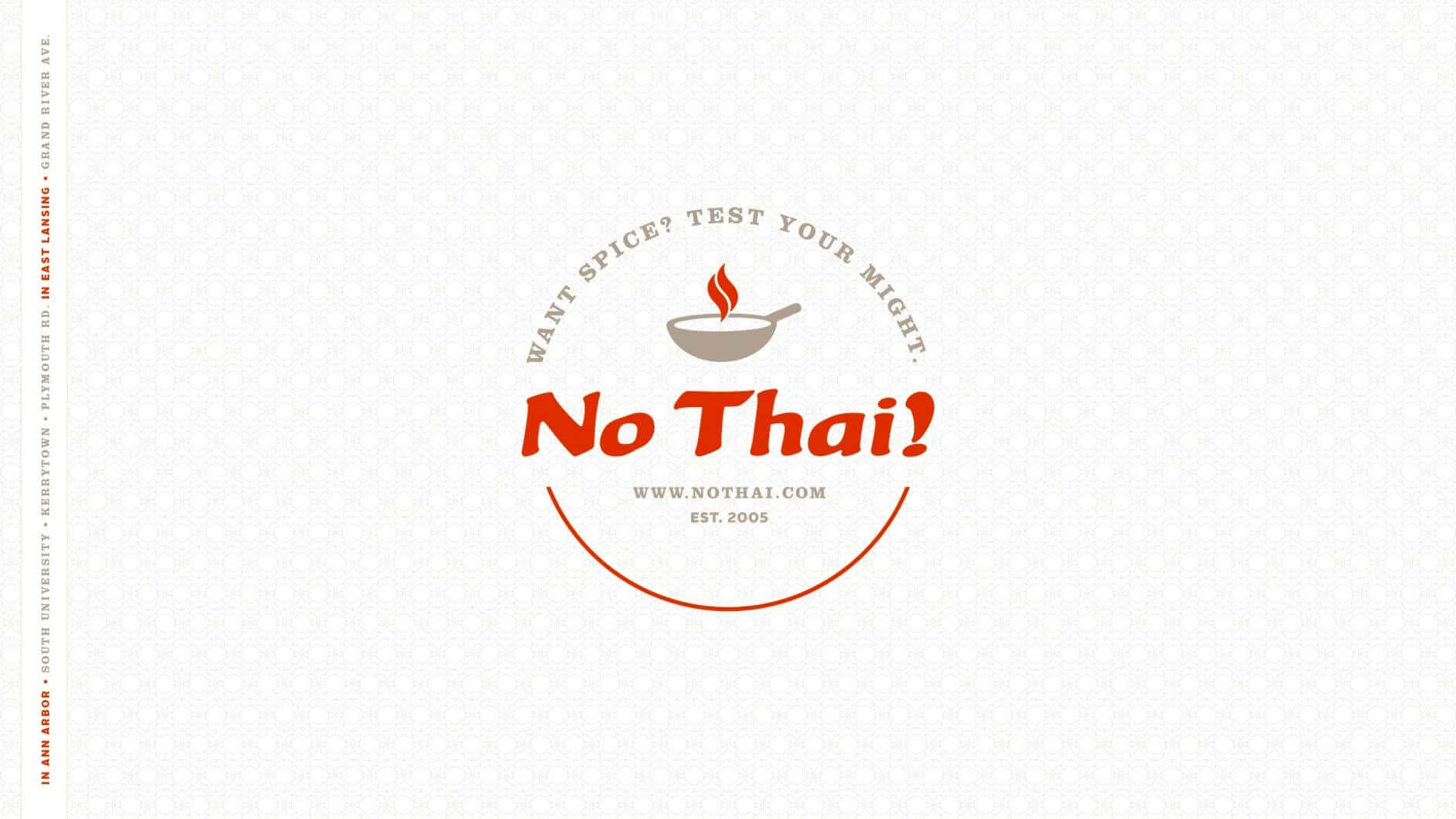
Back

No Thai!

Challenge / Objective

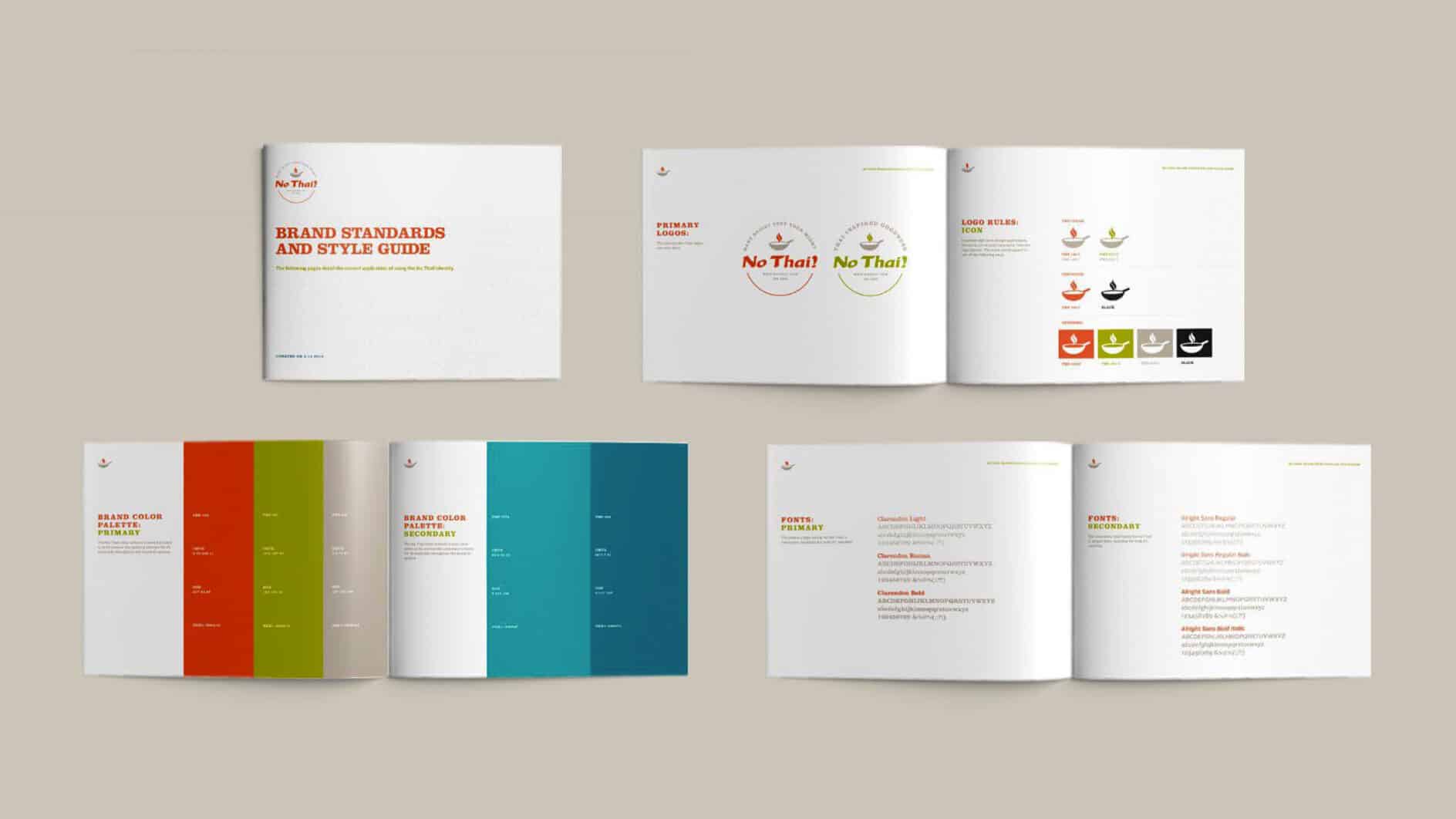
A small, quick-service Thai-inspired restaurant was growing fast. New locations. Thriving reputation. Exceptional growth curve. Yet, their brand was interpreted differently across locations. The more they grew, the more out of control their brand became.

Solution

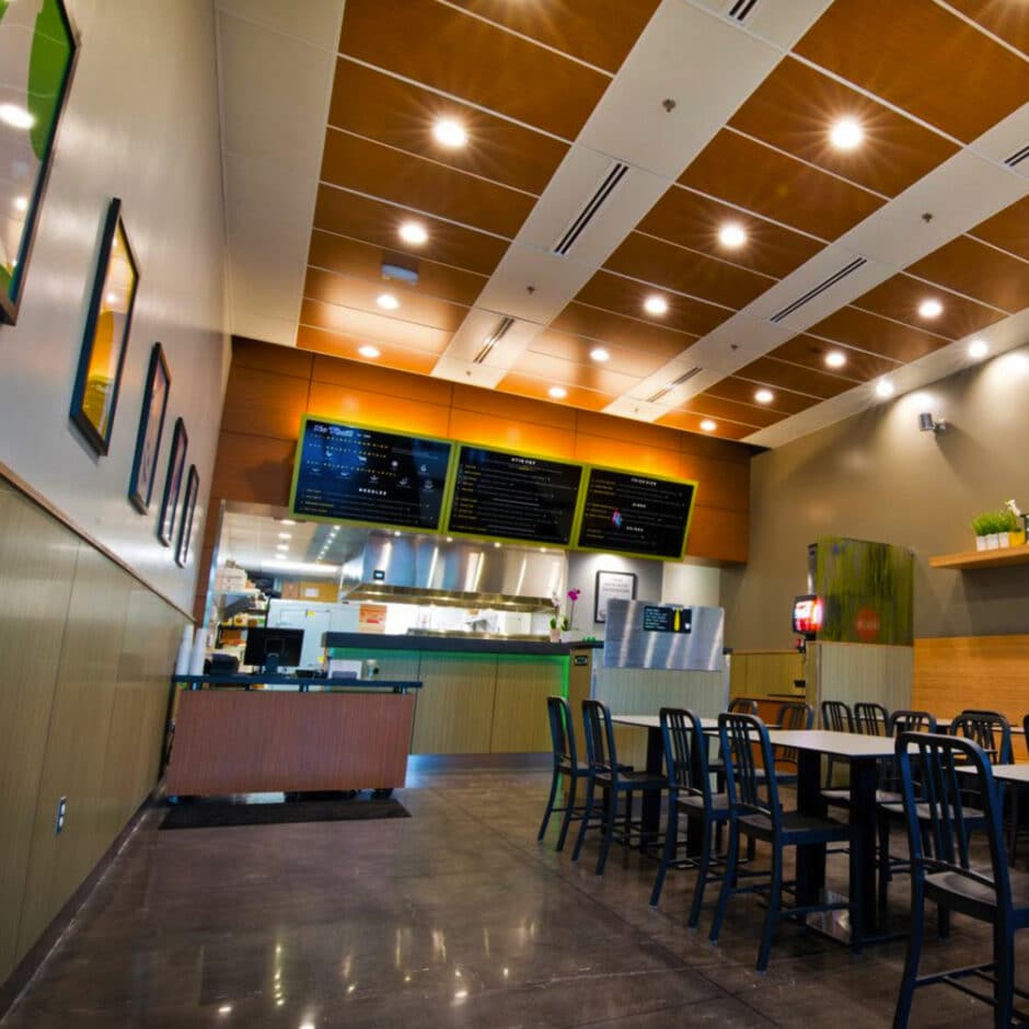
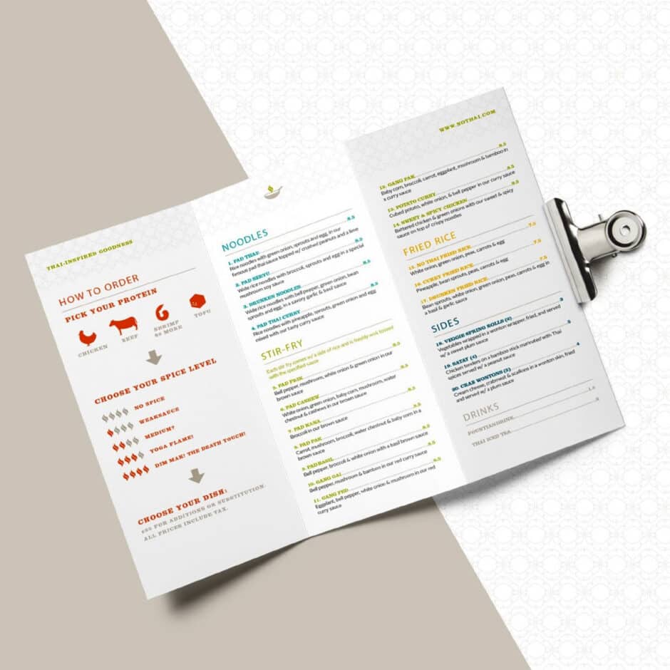
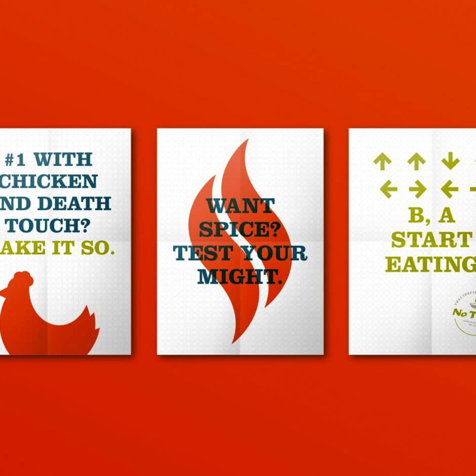
We provided creativity and discipline for the long haul. Through brand research, brand visualization, creative support, environmental, and standardization, we helped No Thai! realize a consistent customer experience that unleashes joy.

Result

An initial investment providing clear direction in future growth, with a brand matching their fun, quirky, youthful spirit.

White food and ingredient icons on an orange background, including a steaming bowl, chicken, shrimp, cow, smiling hexagon, and a chili pepper.
Logo with the text "No Thai!" in bold red beneath a steaming bowl. Above, it reads "Want spice? Test your might." The tone is bold and inviting.
Modern restaurant interior with a high ceiling, bright lighting, and polished floors. Menu boards are displayed above a counter, with tables and chairs in the foreground.A Thai-inspired menu on a clipboard, featuring sections for noodles, stir-fry, fried rice, and sides. Colorful icons and text guide protein and spice level choices.
Four framed minimalist animal silhouettes against colored backgrounds: a chicken on orange, a house with a face on teal, a prawn on blue, and a cow on green.Three posters on an orange background. Left: Chicken silhouette with text about spice. Middle: Flame graphic with “Test Your Might” text. Right: Arrow sequence with “Start Eating.”
Open brand style guide with organized layout. Covers brand standards, colors, and typography. Light background, clean design, professional tone.