Let’s Talk S.M.A.C.
The Subconscious Marriage of Art and Copy (S.M.A.C.) is hidden in superior advertising, and it has the power to completely shape a brand’s message.
Warning: Before you start reading this, you should know that I have a penchant for making things up (see here). That doesn’t mean my commentary isn’t relevant or true… but take this article with a microscopic amount of sodium chloride.
What is S.M.A.C.? It’s my attempt to form an acronym that sounds like a word. It’s also the Subconscious Marriage of Art and Copy, or “a consumer’s tendency to subconsciously unite visual elements of a brand’s message with the message itself.” S.M.A.C. is a powerful tool that any agency uses throughout the process of brand (or rebrand) development.
More shoes. Less thinking.
A brand’s font is the simplest example of S.M.A.C. In short, fonts are the synthesis of artistic expression and literal messaging. But what element is most compelling for the consumer? The visual appeal of letter formations? Or the words that convey meaning?
Consumers don’t read “Just Do It” and consciously parse Nike’s font choice and tagline. They just read it. Thanks to a custom rendition of Futura that pairs effortlessly with the daring words of Dan Wieden, any psychological burden is eliminated for the consumer. And that’s what happens when S.M.A.C. is effective. A brand’s visual identity is perfectly married to the message, and checks appear in Michael Jordan’s mailbox.
Periods everywhere. Period.
Remember the eyeroll-provoking “grain of salt” joke from above? Well, let’s get more granular.
Take a look at the Phire Group logo. See that? That’s a period. Check out every headline on an Apple billboard, every Lululemon print ad, and every BMW digital placement. Every headline ends in a period.
I know what you’re thinking — um, yeah… sentence case phrases require some form of final punctuation. But Red Bull says their wing-forming drink “Vitalizes Body and Mind.” Period!
My copy editor would raise an eyebrow at randomly capitalized words in a “sentence.” Then he would raise a glass because he knows a lot about beer.
The use of periods in advertising is – you guessed it – another S.M.A.C. strategy. And it’s more popular than ever. Brands liberally use periods to feel more modern, more conversational, and often most importantly, more bold. Sometimes They Ignore Grammatical Convention in the Spirit of Being Audacious, even when it comes to a seemingly irrelevant dot.
That dot is far from irrelevant. Similar to a font, strategic period placement can serve as a visual shape that informs consumers of tone and purpose.
One and not the same.
Another section? You probably want to S.M.A.C. my fingers off the keyboard.
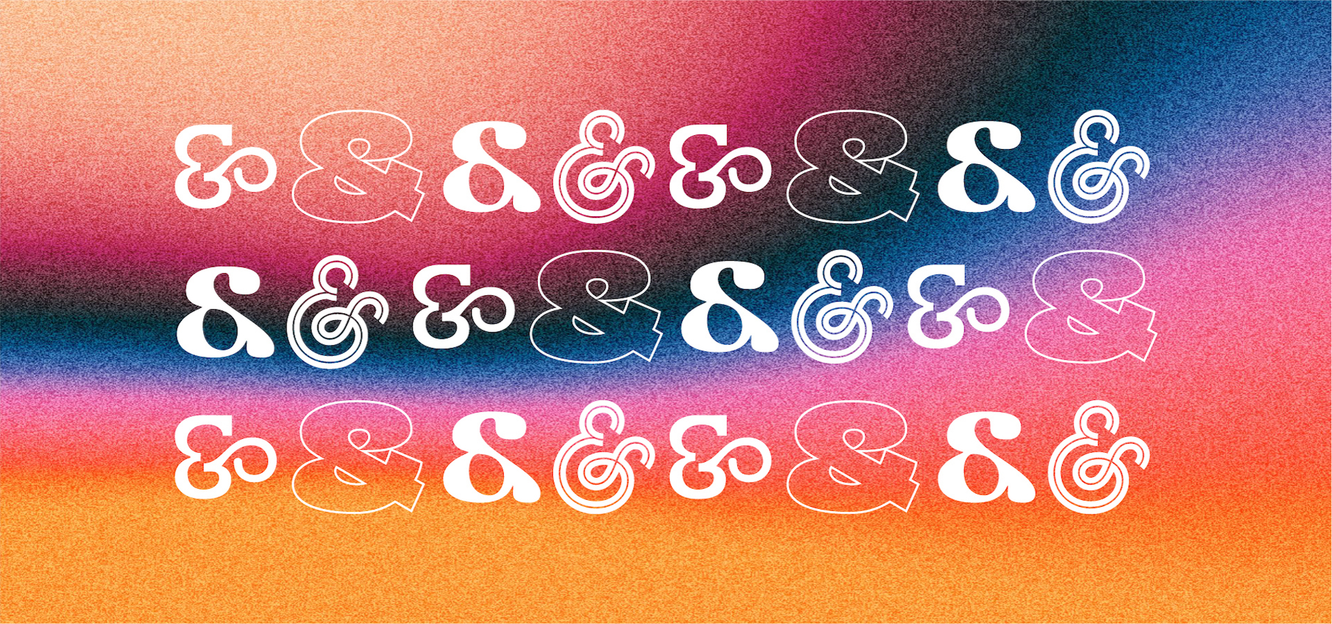
Let’s talk quickly about the word “and.” Or, more specifically, the symbols “&” and “+.”
H&R Block. Ben & Jerry’s. M&M. These brands use an ampersand, and not because it resembles a miniature racetrack. They have an intentional messaging strategy that keeps them approachable. Casual. A little informal. The actual word “and” could technically replace every ampersand, but the brand’s message would change entirely.
You’ll also notice brands that use “+” instead of spelling out “and” or using an ampersand. In fact, the eye care company Bausch + Lomb transitioned from an ampersand to a plus sign in 2010. Why did they see a need for change? Probably because of S.M.A.C.
A plus sign serves the same practical purpose as an ampersand. But Bausch + Lomb now wields a literal difference in visual interpretation and an underlying semantic difference in their message. And I think they made the right choice. The plus sign feels more scientific and technical than the miniature racetrack.
When S.M.A.C. is done correctly, this level of messaging nuance is hard to spot. It’s camouflaged. Innate. Subconscious.
In other words, are those vows written yet? We have a wedding to attend.